Lincolns New Star
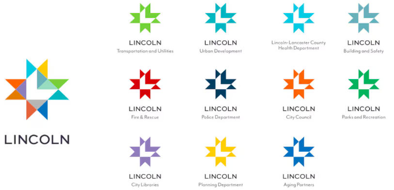
The city of Lincoln, Nebraska, has a new logo, created by Lincoln-based design firm Agency. Read More
The city of Lincoln, Nebraska, has a new logo, created by Lincoln-based design firm Agency. Read More
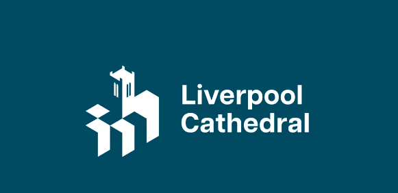
Poke Marketing has created a new identity for the cathedral that takes all this into account, plus reaches out to new audiences, encouraging all comers to Look up. Read More
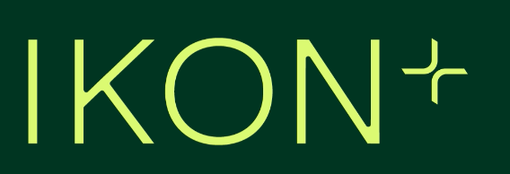
Ikon is a London-based workspace design company that creates truly unique environments. Read More
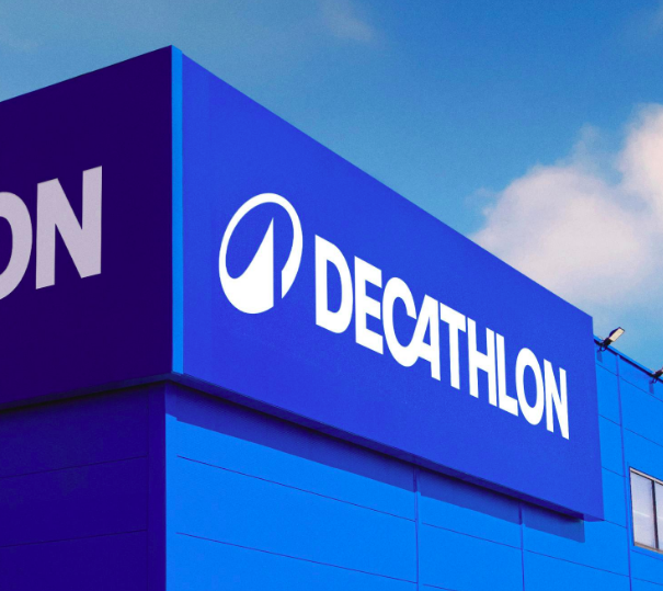
Wolff Olins recently created a logo for Decathlon, nicknamed LOrbit. Its canted, circular shape, meant to suggest motion, surrounds a peak, a symbol commonly associated with achievement and emotion. Read More
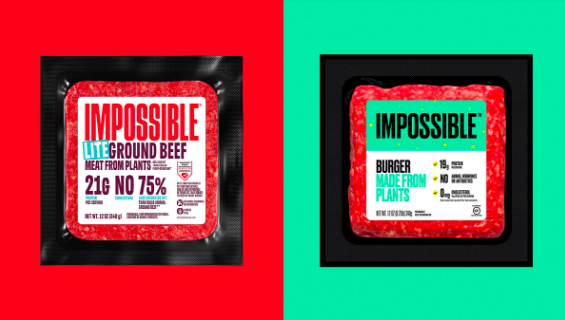
Jones Knowles Ritchie has created a new identity for Impossible Foods. The design is bold, its red, and its meant to combat an almost 15% downturn in plant meat sales. Read More
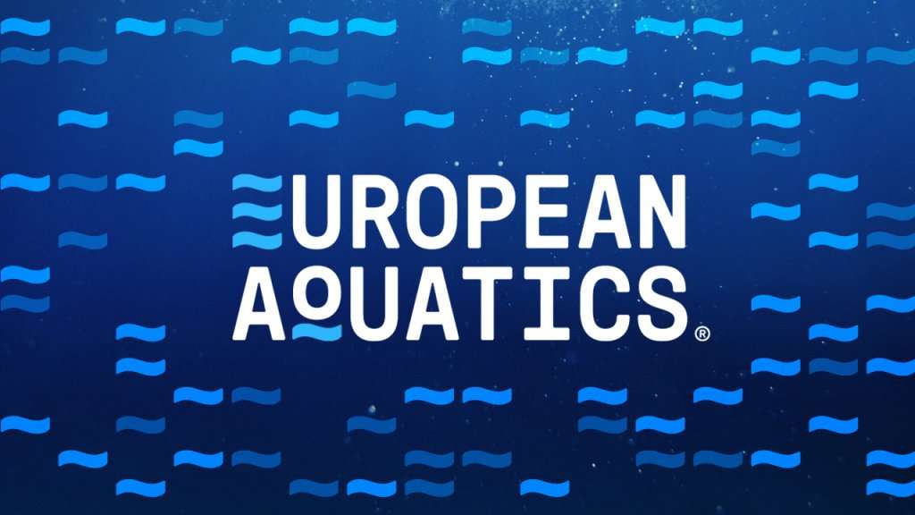
European Aquatics has released its new identity to coincide with World Water Day. Read More

Presenting a designer to take our Center Stage. This months featured member is Emma McGoldrick. With her passion for illustration, hand lettering, branding, and storytelling, Emma has distinguished herself as a creative to watch. Read More
Dixon Baxi created a new logo for British Land, a large UK property and investment company, in late 2022. Read More
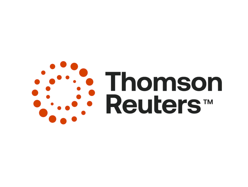
Thomson Reuters provides vetted information and data to professionals in the legal, tax and accounting, and news and media sectors. Its an extremely complex, fast-moving business, but also one that is both relevant and necessary. Read More
The Law Society of Scotland, as part of its 75th anniversary celebration, has introduced a new identity. Read More
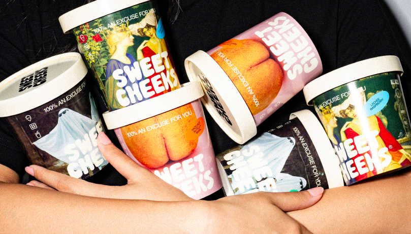
Gelato brand Sweet Cheeks has a new identity created by design firm Bravo. The letterforms in the new wordmark are organic in shape, symbolizing the soft creaminess of gelato. Read More
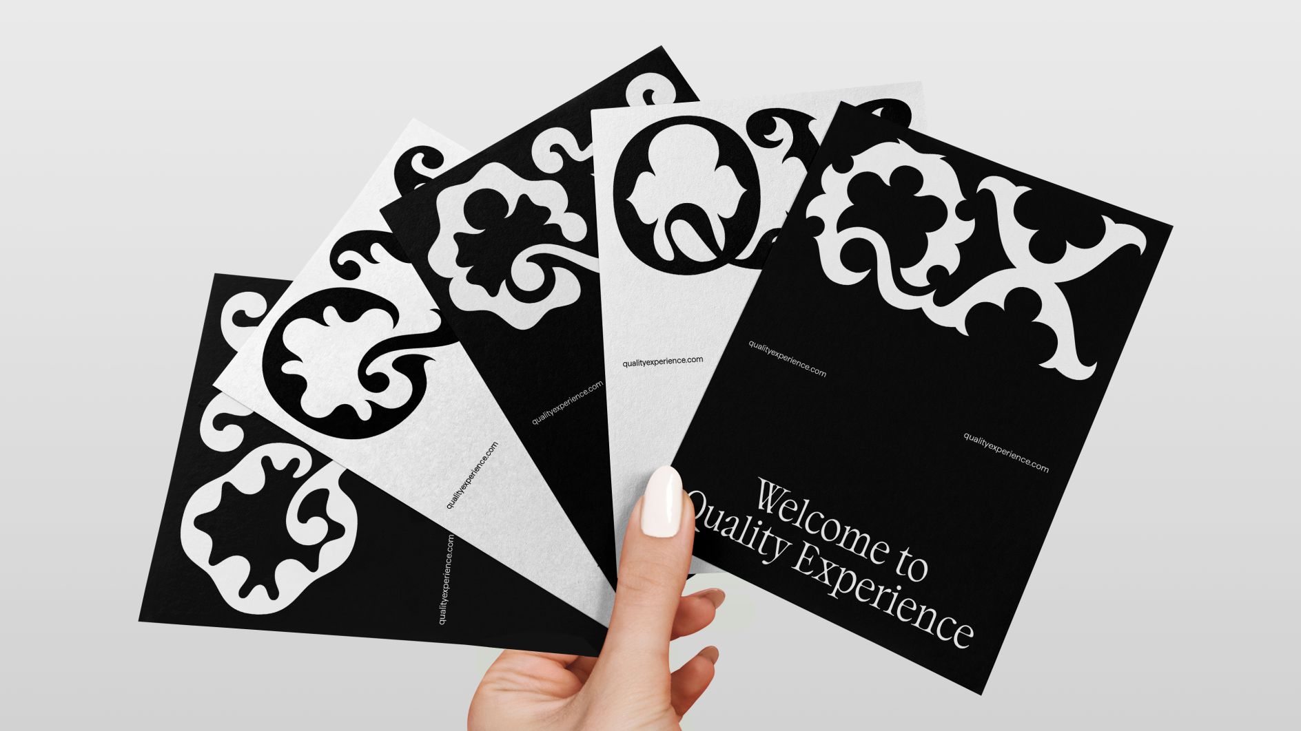
New ad agency Quality Experience, or QX, has a new shape-shifting logo created by &W. Read More
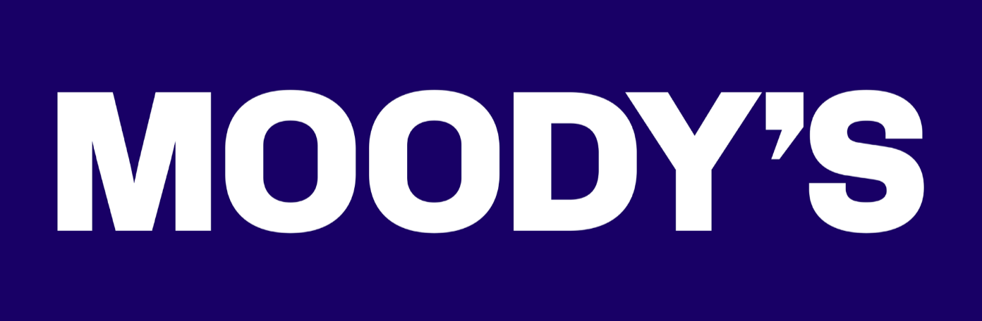
Global risk assessment firm Moodys, now 115-years-old, has a new identity created by Interbrand. An updated brand trajectory, Decode risk. Read More
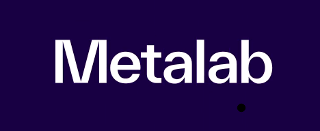
Now redubbed Metalab, the companys wordmark has been reworked. Its use of its long-time brand purple is decidedly more restrained. Read More
Design firm Dixon Baxi has rebranded the service with the goals of being bold and familiar, yet unexpected. Read More